Throughout all stages of production, I have used a variety of different media technologies in order to make my documentary and ancillaries the most pragmatic and relevant as possible. I decided to adventure out during this period using a variety of different hardware and software in order to adapt my knowledge and be able to gain as many marks as I could.
*EVERY MEDIA INSTITUTION OR TECHNOLOGY MENTIONED THROUGHOUT IS IN BOLD*
Pre-production
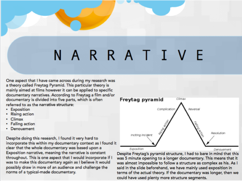
Google was my main use of media technologies for most of my research as by choosing to do a documentary I would be entering a world in which I have never attempted to undertake before and wanted it to be a learning curve on my knowledge for the media and film industry. I ha![]() d to use Google in order to research many aspects that I had no existing knowledge for beforehand, for instance this would be where I learnt about the significance on narrative documentary structures e.g Freytags’ pyramid. This significantly helped me to really visualise what I was going to film and it placed all my ideas together within a structure. I used the following websites to seek my knowledge of this:
d to use Google in order to research many aspects that I had no existing knowledge for beforehand, for instance this would be where I learnt about the significance on narrative documentary structures e.g Freytags’ pyramid. This significantly helped me to really visualise what I was going to film and it placed all my ideas together within a structure. I used the following websites to seek my knowledge of this:
http://www.ohio.edu/people/hartleyg/ref/fiction/freytag.html
http://www.desktop-documentaries.com/documentary-structure.html
 Another way in which I used Google for my main task research was to research the most popular institution for my documentary and which channel it would fit into best. I did this by using the Channel 4 website and their tips on how to produce something to their standard without giving away their exact secrets. This was a huge help to me as I could only see what I saw visually in magazines and tv, I had no idea that everything such as; colours, aspects, positioning etc was so well thought out. I believe that when taking into a count, these are 2 aspects which really foreshadow my outcome as they have placed both my poster and double-page spread onto the successful and profession channel 4 standard. Here is some links I used during my research:
Click to access C4StyleGuide1.1.pdf
https://www.asa.org.uk/rulings/channel-four-television-corporation-a12-197451.html
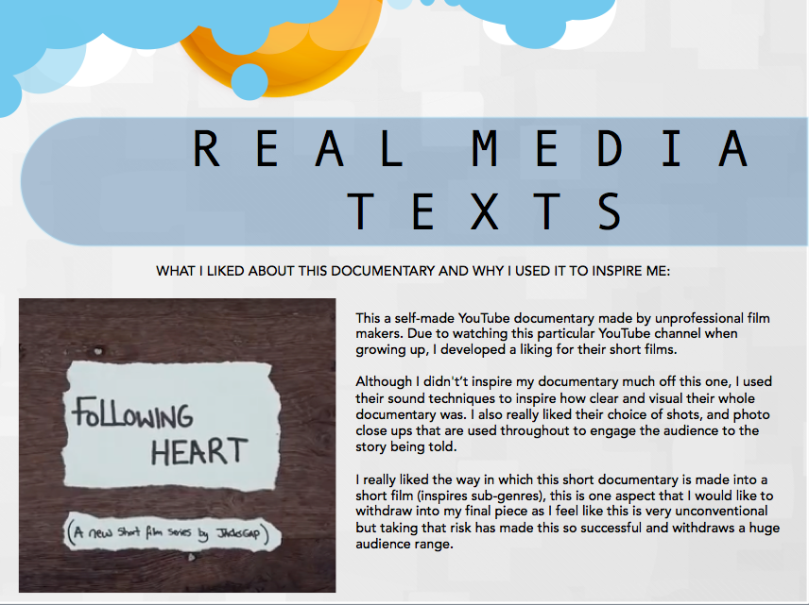
 When looking into actual documentaries and the ideas behind them to inspire me, YouTube was very useful in showing me a wide range of documentaries in both quality and in topics helping me understand a variety of different outcomes and how they might shape my own documentary. Not only did I find a variety of real-media documentaries during this, but also some made by teenagers of my age and A2 other media students. I mainly used YouTube to analyse mistakes that people have made- a significant one which I found was lighting and sound- therefore this is something I focused on making perfect throughout my production.
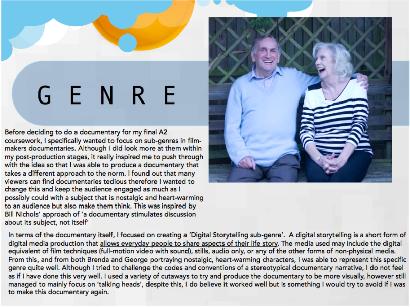
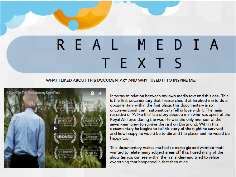
Short of the Week was a very useful website during my research as it provided me with the most inspirational and unconventional documentary that I found really reflected my desire to make a documentary, and this was BAR. BAR itself is a short, self-made documentary that focuses on the life of an elderly man narrated by his Grandson through pictures and metaphors rather than just filming a man constantly talking and making it look good through editing. Joe and I loved almost everything about BAR, including the nostalgic undertones to the warm mode of address which was used throughout and this quickly became something we wanted to give our audience on the outcome of Passage Of Time. Below you can find the links to my analysis of documentaries:
https://amyhomewoodmedia.wordpress.com/2016/07/19/main-task-research-documentary-analysis/
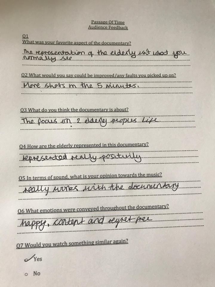
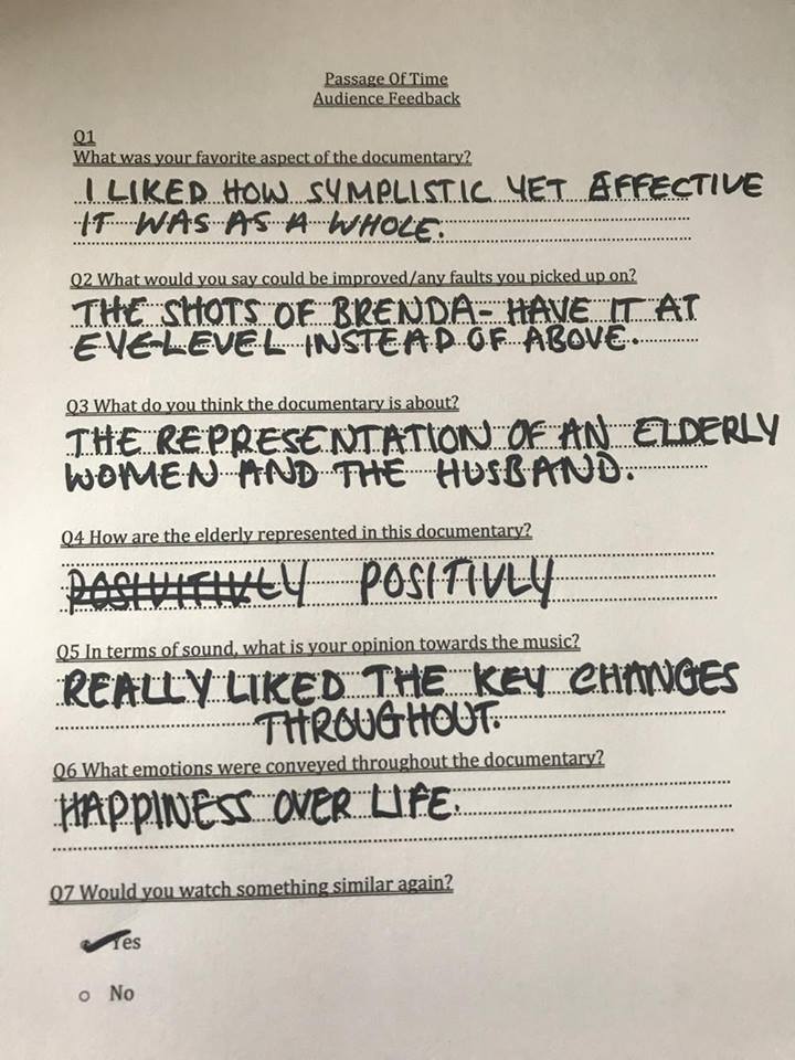
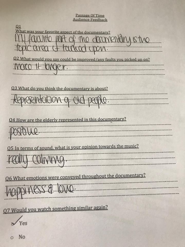
Survey Monkey is another website that I found online in which Joe and I used to create our own questionnaire and send it to whomever you want through email to respond to it which then allows you to access what what was said and which answers were picked online, making it a lot easier to corrolate quantitative and qualitative data. Using this website, gave both Joe and I many benefits as there was no risk of losing the data as it was all saved on the website rather than losing pieces of paper and having to do everything again.
![]() However, there were a few slight disadvantages of using Survey Monkey which Joe and I quickly realised. For example; as we wasn’t a paid up member, we was limited to only ten questions which meant we had to cut several important questions out which could’ve been insightful in helping us create a better product. Despite this disadvantage, we placed the most important questions first, and did many other research tasks to ensure we left nothing out- such as a variety of audience feedbacks.
However, there were a few slight disadvantages of using Survey Monkey which Joe and I quickly realised. For example; as we wasn’t a paid up member, we was limited to only ten questions which meant we had to cut several important questions out which could’ve been insightful in helping us create a better product. Despite this disadvantage, we placed the most important questions first, and did many other research tasks to ensure we left nothing out- such as a variety of audience feedbacks.
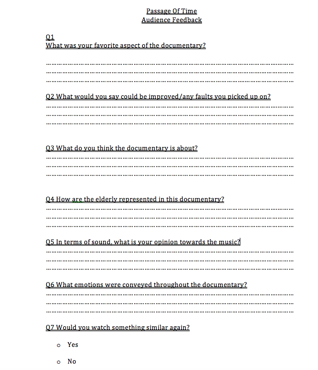
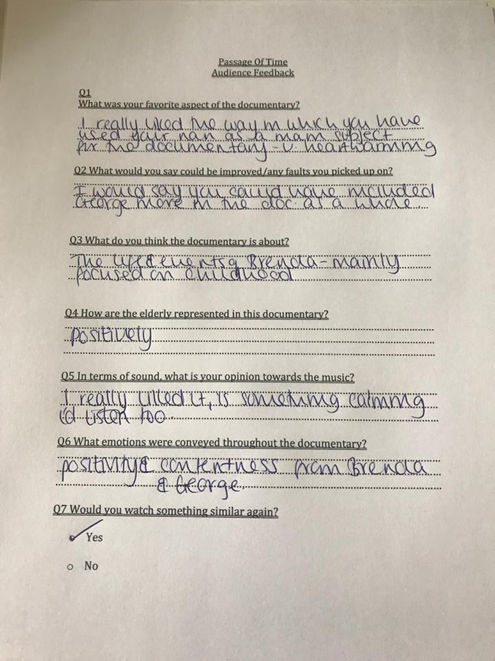
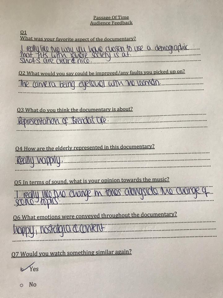
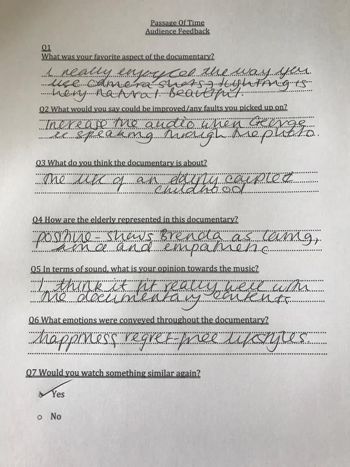
Another slight disadvantage was that being an online questionnaire not everyone answered it/successfully received it making our responses limited, and due to it being online, we couldn’t get many answers off people over the age of 50. To fix this problem, we focused another aspect of our research onto the older population which was the creation of a second questionnaire for the title of our production. For this we gave our audience a standard physical copy that I created on word guaranteeing responses from every single candidate.
Production
Camera
The camera I used was mainly a Canon 600D which I borrowed from the school, however I did use my own Canon 1100D for photos and some of the cutaways. Using this camera in my production allowed me to get familiar with all of its features, including the manual zoom focus which I had never discovered I could do beforehand that made each shot look even better when editing then it did on the camera screen during filming.
Rode and wearable mic
Similarly to the camera, I thought it would be useful to do several tests with the mics as 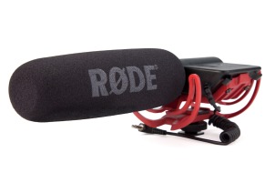 through my research of analysis of documentaries, I found was vital if you wanted to produce a successful documentary. From the mic-tests we did, I found that despite being in a quiet environment the rode mic still picked up a lot of background noise that sounded absolutely horrible when coming to edit it. This completely contrasted with the the wearable mic’s as the s
ound was so very clear providing it wasn’t too close to the interviewee- this also helped as we got to listen to headphones whilst Brenda was talking therefore we always so careful on the placement of it. This another very useful learning curve as the sound is one aspect of our documentary that I am very proud of.
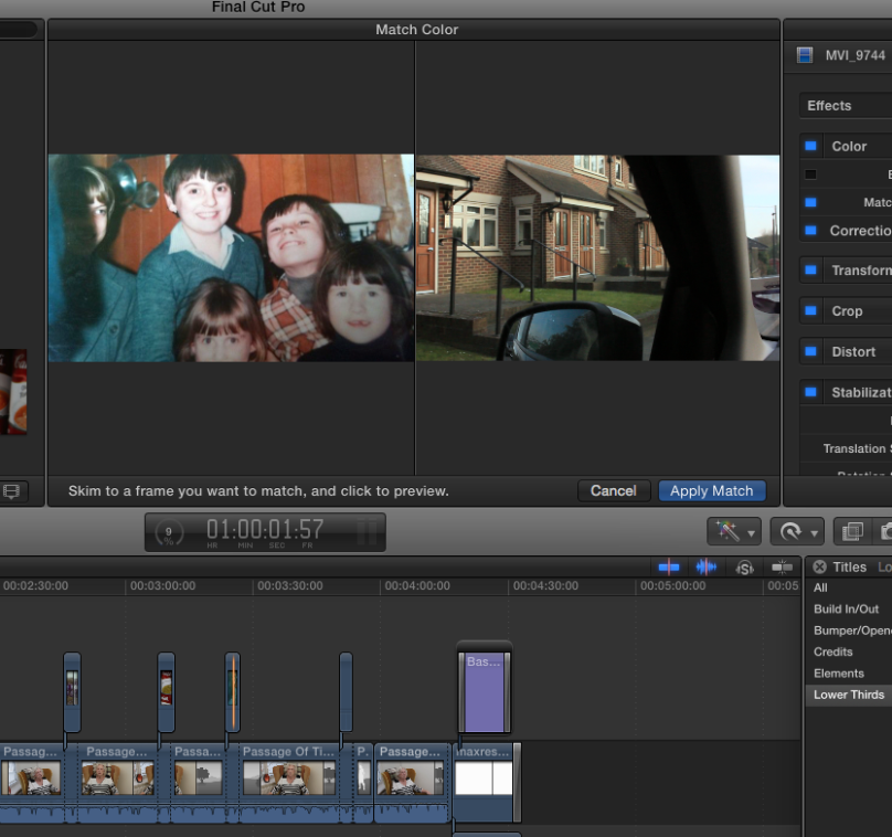
Final Cut Pro
This is definitely an area I could’ve improved on as the only time I used Final cut pro during planning was when we composed the first cut of our documentary. This shows poor planning as when you look at the other
technologies that I used I practised with them and planned out how I would use each one. This potentially meant that because of the lack of planning/testing I wasn’t able to use the editing software in a more complex way which might’ve helped subvert the genre compared to the very conventional documentary that was made.
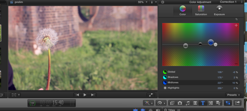
I made a variety of adjustments to my documentary whilst editing as there were many faults that I managed to picked out. This began with colour correcting and colour matching difference scenes of the documentary. I decided to use a filter, made with a combination of purple, yellow and blue colours to make the cutaway image look vintage and superior. I believe that this worked well as the documentary is all shot in one specific colour, making it look more professional and high-quality. At the beginning of the editing process, colour corrections and colour matches was not something I felt very confident with at all, but is now however a skill I have gained from the whole process and is something I will use in future editing schemes.
Similarly to the colour correcting adjustments I made in the editing process, I also became very familiar with many of the tool options available on final cut pro that I hadn’t used much beforehand. It goes without saying that the cut tool was used throughout editing, this is something I believe I became very quick and efficient at as I found out you could use the arrow keys on a keyboard to jump between key frames, which became very useful when placing my cutaways over the place-holders. I did use many Ken-Burns’ throughout editing, specifically on the photos. I engaged a lot of time in the start and end points of each cut away image, and quickly came to the realisation that I didn’t need the image to zoom all the way in for it to be affective, this is one aspect that I am very proud of in terms of my finished product.
One tool I became very familiar with was being able too enable/disable clips- making the music and the images separate. This isn’t something that largely impacted the documentary itself but made it very easy for me to adjust the volume of the dialogue over the music. This was something very important as otherwise the music would have overpowered the dialogue and make the documentary itself seem very improper.
Sound
For the making of the music, I used a variety of different software and instruments to make this whole documentary to have such a nostalgic background.
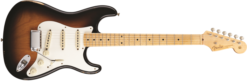
The instruments used was mainly a combination of a Fender Strato-caster guitar and a Cajon drum played by Chris after we sat and made the guideline of what I wanted, and how it would sit into the documentary. Although I would love to say I played the music, I didn’t. But Joe and I did however try and get involved as much as we can with Chris.
Other equipment we used throughout this process was an Orange Crush Pro Amp, Reverb and Whammy Pedal whilst the music itself was written in Open G tuning with a partial capo on the 7th fret. Again, Chris had to help us gain knowledge in this as Joe and I are not music makers but using this really helped me adapt to the way in which I view music and the effort we all put in really paid off in the end as the music![]() turnt out very original with both minor and major keys’ being hit throughout the piece.
turnt out very original with both minor and major keys’ being hit throughout the piece.
The software used to edit the music was mainly the Audacity Music Software, however we did decide to Final Cut Pro for any additional tone adjustments we had to do at the end. This is one aspect that I believe really paid off as I wasn’t familiar with Audacity beforehand, and now from being shown through YouTube tutorials, I know how to use quite well.
Ancillaries
Camera
For my ancillary photos, I used a Canon 600D that my school did in fact lend me. However, I did switch between from an iPhone 7 camera and an Canon 1100D for various reasons throughout the ancillaries. I used this camera in a completely different way, as I found out a lot more about photography and the way photos can speak a bigger picture through my own research at home. I decided to try out different shutter speeds, lighting types, focus types and filters on the camera in order to create both my ancillaries’ photos. I believe that this was successful as overall I am very happy with the clearness of the photos themselves.
Double page spread
For my double page spread; I mainly used Photoshop and Adobe Indesign as I feel like my knowledge of both softwares made it the easiest to produce this work. Indesign was one software I wasn’t as confident with at all at the start, until I quickly same to realise that it was fairly similar to photoshop after needing assistance from Joe. This is one aspect of this whole process that I am very proud of as I tried to use many different softwares to adapt my knowledge and this is where I personally feel it paid off.
Documentary poster
In order to produce this, I used a combination of photoshop as well as Pi
c-monkey to produce my final product. I used photoshop for sharping up the photo, white balancing it and making sure it was clear as possible, including the placement of the channel 4 logo. Whilst I used pic-monkey to place the text and the textbook. I didn’t have to do much to this ancillary as this was very basic and easy to do which helped due my knowledge of both programmes.
Evaluation
WordPress
Having used WordPress and Blogger throughout my Media A-Level, having WordPress made it very easy for me to keep organised as I have made blogposts I need to make during this process and simply ticked it off as I go. The technology as a whole is so easy to use, you can use a range of media-technologies onto this website which helped me throughout and allowed me to adapt my knowledge into the app itself.
Powerpoint
Having used powerpoint thousands of times before this evaluation, I used my skills and knowledge of the programme to make one of my evaluation questions. I did this because the app is very easy to use, and can present a variety of information in a eye -catching and suitable way. From this, I could organise my information very clearly and was able to point out where I could place new info, and where to delete others.
iMovie
For my evaluation question 2, I used iMovie to edit my evaluation together by using a variety of different screen grabs and cutaways, overlapping my narration that I recorded using an iPhone Mic and sound effects I found on Garage Band, I personally believe that this made the evaluation a lot clearer as an audience wouldn’t have to read loads of writing, instead they watch something that I have made visually pleasing for them. As I have a lot of knowledge on iMovie already, I found making my evaluation very easy as I drafted the script several times beforehand, however I did have to re-edit a lot but I think this  ended up as successful as it could have been.
And that is how I used media technologies within each stage of my media production and I believe all in all, it turnt out successful and is something I am very proud of.